Sunburst Chart: When to Use it and How to Craft Easily
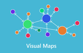
A sunburst chart is a reliable visual that uses circles or rings to present hierarchical data clearly and comprehensively, making it easy to see relationships between categories and subcategories at a glance. Starting from a central circle representing the root or main category, each layer radiates outward, with segments that break down into finer levels of detail, much like the branches of a tree, but arranged in a circular format. If you are interested in learning everything about the chart, read this article. We will give you all the details you need, including its complete definition, when to use it, and what it's best for. You will also learn how to create the chart using an excellent tool. Thus, join us to learn more.

- Part 1. What is a Sunburst Chart
- Part 2. How to Draw a Sunburst Chart
- Part 3. Best Tips when Creating a Sunburst Chart
- Part 4. FAQs about Sunburst Chart
Part 1. What is a Sunburst Chart
A Sunburst chart is an excellent visual tool for displaying hierarchical data through concentric rings. From its core, the innermost circle represents the main topic/category. Each subsequent ring, moving outward, represents a deeper level of hierarchy. In addition, the segments within each ring are sized by the information they represent, making it easy to see how categories break down into subcategories. The chart also shows how they contribute collectively. This type of chart is effective for viewing relationships and proportions in multi-level datasets, offering a more space-efficient and visually engaging alternative to linear tree diagrams.
A sunburst chart can display and show numerous levels of data simultaneously, unlike a standard pie chart, which displays only one. Plus, the chart is well-suited to examining intricate systems such as organizational hierarchies, product categories, or website navigation patterns. By linking back to its parent segment, each outer ring provides context and enables viewers to follow patterns and proportions at varying levels of detail. Because of this, sunburst charts are particularly helpful in data science, business analytics, and educational settings where depth and clarity are equally crucial.
Use Cases for Sunburst
You can use the Sunburst chart in many ways. Review the information below and explore practical use cases.
Organizational Hierarchies
The chart is ideal for visualizing the company structure. You can use it to show teams, departments, and individual roles in a comprehensive, clear, layered format. The central circle represents the entire organization, with outer rings representing divisions, then departments, and finally employees. With the chart, stakeholders can instantly understand reporting lines and the relative sizes of each unit without resorting to a more complex chart.
Product Category Breakdown
Retailers and e-commerce sites use Sunburst charts to show product categories and subcategories. The middle circle may represent Electronics, for instance, while the surrounding rings display Mobile Phones, iPad, Computers, Laptops, and Accessories, with additional layers decomposing into distinct brands or models. Managers can use this to evaluate how sales are distributed across categories and determine which product lines generate the most income.
Website Navigation Analysis
In the field of UX design and digital marketing, a Sunburst chart can play a vital role. It can map user navigation paths via the website. The root node will serve as the homepage. The subsequent rings show the categories, subcategories, and pages visited. With this chart, you can highlight the sections that attract the most traffic and where users tend to drop off, making it simple to optimize site structure and enhance user experience.
Financial Budget Allocation
When allocating a budget, there is no doubt that a Sunburst chart can help you. It can show how a particular organization's budget is distributed across multiple levels. The core of the circle might represent the total budget. Then, the outer rings will serve as allocations for projects, departments, and specific activities. A Sunburst chart can help you compare proportions, identify imbalances, and ensure resources are aligned with priorities. The chart is useful for presenting financial data to a non-technical audience in a visually appealing manner.
Best For
For displaying hierarchical data in a space-efficient, easy-to-understand format, a sunburst chart is well-suited. In contrast to linear tree diagrams, it enables the simultaneous display of multiple levels of information in concentric rings, making it well-suited to illustrating how categories subdivide into subcategories and how each component contributes to the total. The chart is best for:
- • Organizational structures – departments > teams > individuals
- • Product breakdowns – main category > subcategory > brand/model
- • Budget allocations – total > department > project > activity
- • Website navigation paths – homepage > categories > subpages
After learning everything, we can conclude that the Sunburst chart is ideal for exploring complex, multi-level data while retaining clarity and proportional context.
Part 2. How to Draw a Sunburst Chart
Do you need to use a Sunburst chart to show your data in a well-structured manner? Then, you must create one. However, with so many chart makers out there, it can be confusing to know which to use. In that case, we recommend using MindOnMap. This chart creator is perfect because it lets you access all the features you need to create your chart. It can give you the circle shape that you need, font styles, colors, and more. The best part is that you can use the Theme feature to create an appealing Sunburst chart. Aside from that, using the tool is simple thanks to its straightforward user interface. It also uses AI-powered technology to help you achieve the results you want with high accuracy. Lastly, you can also save your final Sunburst chart in various formats. You can save it as PDF, SVG, DOCX, PNG, JPG, and more. Thus, if you need an excellent chart maker, look no further than MindOnMap.
More Features
- • The tool can create various visual representations, such as charts, diagrams, tables, and more.
- • It can offer various templates to speed up the creation process.
- • The collaboration feature is available for group work and brainstorming.
- • The chart maker is accessible on multiple platforms, including Windows, macOS, Android, and iOS.
To start creating your Sunburst chart, you can follow the detailed steps below.
Tap the Download button below to access MindOnMap on your computer. After that, you can now connect your Gmail or sign up.
Secure Download
Secure Download
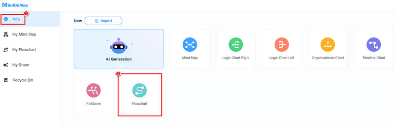
After you launch the primary interface, go to the New section and choose the Flowchart feature. After the loading process, go to the next step.
You can now start making the Sunburst chart. Go to the General section to add the Circle shape. Then double-tap the shape to insert the information.
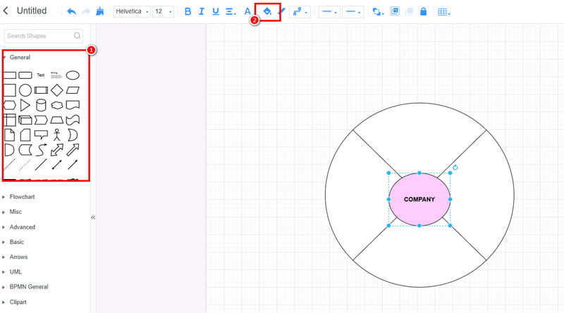
To add color to the shape, use the Fill feature above.
After creating the chart, click Save to save it to your MindOnMap account. You can also use the Export button to save it on your computer in various formats.
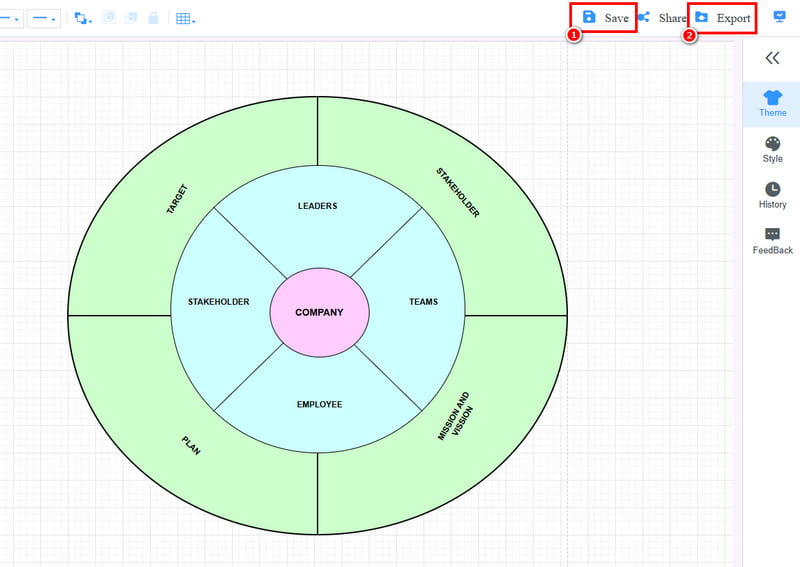
Click here to see the entire Sunburst chart designed by MindOnMap.
Creating a Sunburst chart is simple with this tool. It can provide all the shapes and elements you need, allowing you to achieve your preferred result after creation. In addition, MindOnMap lets you craft more visual representations, including RACI charts, comparison tables, timelines, and more. Thus, to create well-structured visuals, rely on this tool.
Part 3. Best Tips when Creating a Sunburst Chart
There are various things you need to consider when creating your Sunburst chart. Read all the best tips here to get more insights.
- • Always organize the data according to the hierarchy for better results.
- • You can use various colors to create an engaging and appealing chart.
- • Limit the number of layers to avoid confusion.
- • Use a chart maker that gives you all the features you need for a smooth creation process.
- • A single word or a few words are more ideal than using a sentence.
Part 4. FAQs about Sunburst Chart
Can you create a Sunburst chart in Excel?
Definitely, yes. Creating the chart is possible because Excel provides all the necessary features. The best part of the tool is that you can access free templates that help you complete the process smoothly and easily.
What are the best tools to create a Sunburst chart?
There are various tools you can use to create the chart. Some of them are MindOnMap, Excel, PowerPoint, XMind, and more. Choose your preferred tool and start creating the best chart.
What are the drawbacks of the Sunburst chart?
When making a chart with numerous layers, it can be complicated to view. With that, always use a simple chart with a few layers to make it more comprehensive.
Conclusion
The Sunburst chart is an ideal visual representation for showing hierarchies in various fields. Thanks to this post, you have learned everything you need about the chart. Plus, if you want to craft your Sunburst chart, we suggest using MindOnMap. This tool can offer all the powerful features you need. It can give a straightforward layout, allowing you to create the best chart smoothly. Thus, access this tool and achieve your desired outcome.