Discover Bar Graph Templates and Examples for Different Uses
A bar graph is the best visual presentation tool for arranging information. With the assistance of a bar graph, you can interpret the data easily. You can also use this graph to identify the similarities and differences between certain concepts. This guidepost will give you numerous bar graph examples and templates. This way, you will get more insights about the bar graph. Also, you can use the templates if you want to create one. Moreover, aside from the templates and examples, the article has a bonus for you. The post prepared a simple tutorial on creating a bar graph using an online tool. So, to obtain all the information, click and read the post right now!
- Part 1. Bar Graph Examples
- Part 2. Bar Graph Templates
- Part 3. How to Make A Bar Graph
- Part 4. FAQs about Bar Graph Examples and Templates
Part 1. Bar Graph Examples
The information below is the different examples of a bar chart. If you want to create your bar chart, use the examples as your basis. This way, you will understand what an excellent bar graph looks like.
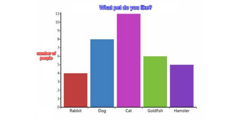
Vertical Bar Graph Example
This example is a vertical bar graph. The visual representation shows that the topic is the number of people who like pets. The x-axis is about the options or categories (pets). Then, the y-axis is about the number of people. Based on the data, the highest number of people chose the cat. This example shows that you can use a bar graph to gather information. This way, you can see the data better and clearly. In addition, you can use this type of graph in different scenarios. It includes getting data about foods, people, places, etc.
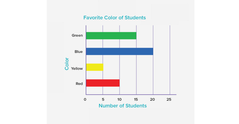
Horizontal Bar Graph Example
In this example, the graph is a horizontal bar graph. This visual presentation is about the favorite colors of the students. On the x-axis, you can see the number of students. You can see the various colors on the y-axis. Based on the given data, the highest chosen color was blue. The lowest is green. You can easily understand the data in this graph without a deeper explanation. Also, as you can see, the graph is slightly the same on the vertical bar graph. However, you need to input the data and make the bar graph horizontally in this graph.
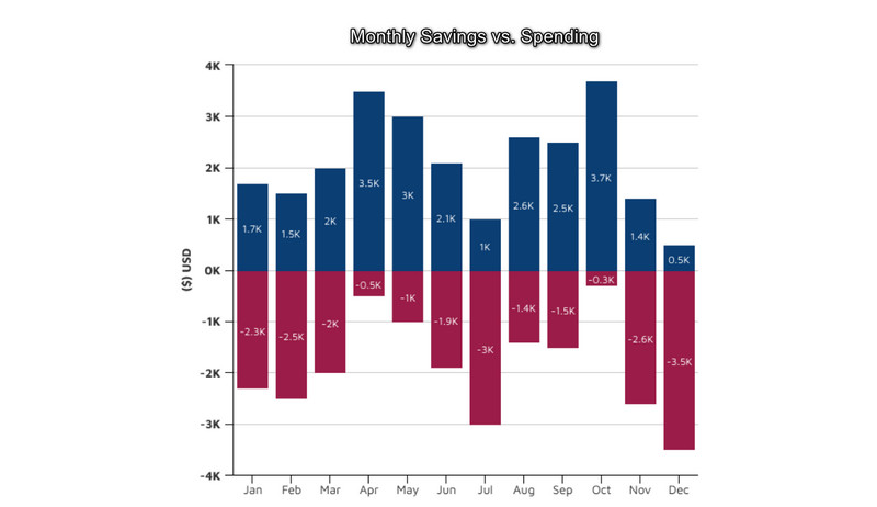
Stacked Bar Graph Example
A stacked bar chart displays each category's sum or average. The volume of those numerical values increases with increasing bar height. The bar graph below illustrates how each category stacks up against the average. The sum for each category is displayed in the bottom bar. On the dual-axis charts, take note of the data labels. This straightforward clustered bar graph displays the proportions of savings and consumption. It monitors trends, which helps display data in reports. In addition, this kind of chart helps identify a trend across a period of time. There are more uses for a stacked bar graph. It includes supply and demand, mileage vs. performance, the spending vs. result, and more. A stacked bar chart can assist you when you want to compare minor aspects and complete the general category information.
Part 2. Bar Graph Templates
Here are the bar graph templates you can use for various use cases.
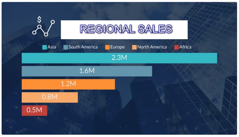
Regional Sales Bar Graph Templates
If you are in a business and want to showcase your company's sales in every region, you can use this template.
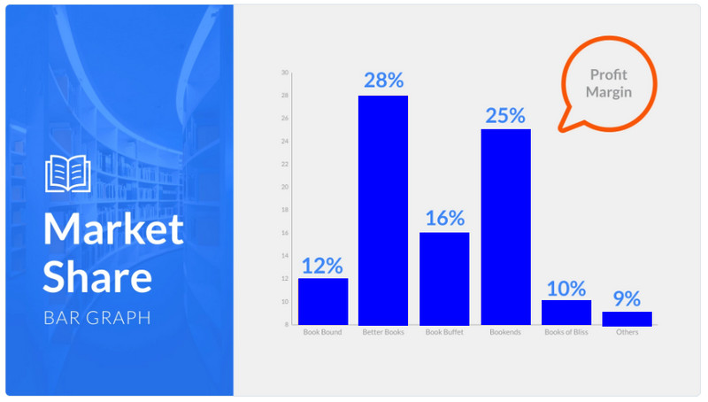
Market Share Bar Graph Templates
You can display the market share of the company and the competitors. This way, you can visualize the data and know what actions to take.
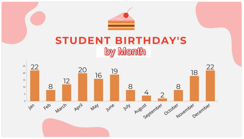
Student Birthday Bar Graph Templates
Use this bar graph template to view the month with the most birthdays.
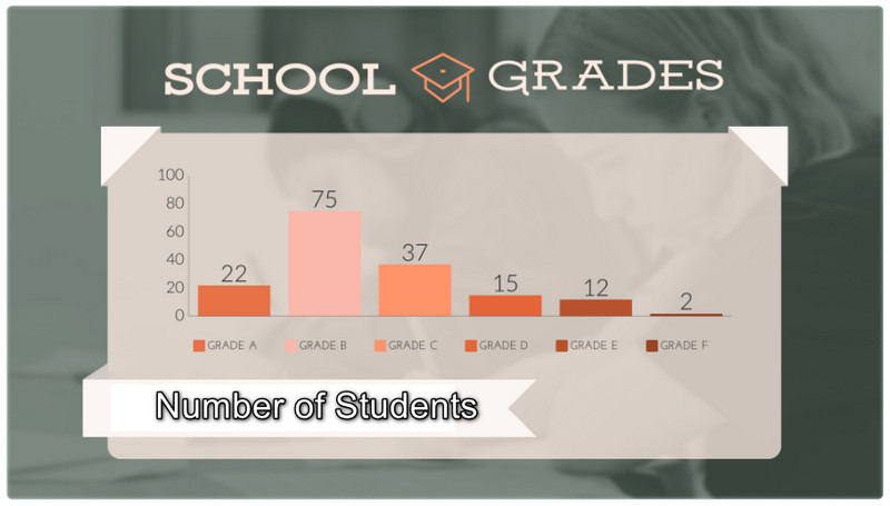
School Grade Bar Graph Templates
You can break down the student’s number by grade level using this bar graph template.
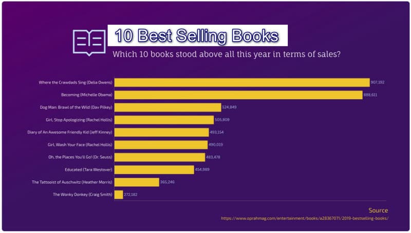
Best Selling Books Bar Graph Templates
If you want to record information about the most-sold books in a specific year.
Part 3. How to Make A Bar Graph
In this part, you will get an idea of how to make a bar graph using an online tool. One of the most influential bar graph makers you can use is MindOnMap. It has an intuitive layout making it perfect for beginners. The tutorial is also easy to follow on this tool. You can use all the elements you need to make a bar graph. You can get shapes, lines, numbers, text, and more. Also, free themes are available. With the help of these themes, you can have a colorful yet understandable bar graph. You can also let other users edit your graph with its collaborative feature. Send the link to show your output to other users. You can also access MindOnMap on all browsers. It is available on Google, Firefox, Safari, and more. Use the simple steps below to create a bar graph.
Secure Download
Secure Download
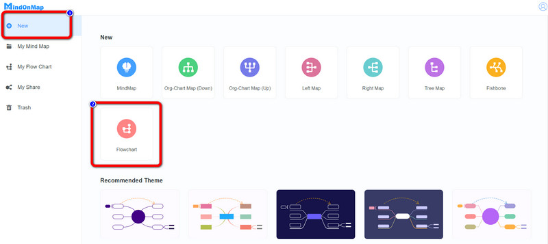
Visit the website of MindOnMap. Then, click the Create Your Mind Map from the web page.

After that, choose the New option from the web page. Then click the Flowchart icon. After clicking, the main interface will show up on the screen.
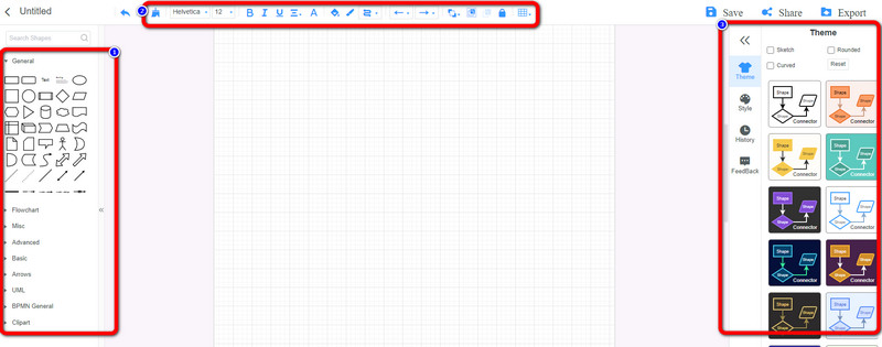
In the main interface, you can start creating a bar graph. Use the shapes, lines, and text on the left interface. Then, to insert various colors, go to the upper interface. You can also choose your preferred theme on the right interface.
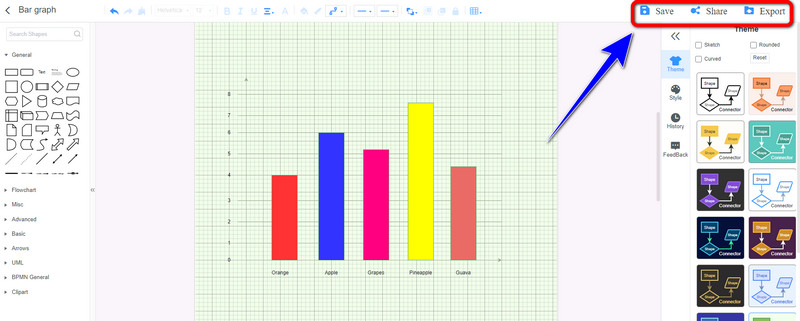
Click the Save button to save your final bar graph on your MindOnMap account. Click the Share option to send the graph to other users. To export the output to various formats from this bar graph maker, click the Export button.
Part 4. FAQs about Bar Graph Examples and Templates
1. How do you create a bar graph on Google?
To create a bar graph on Google, use Google Sheets. First, input all the information into cells. After that, navigate to the Insert tab and click the Chart option. This way, the bar chart will pop up on Google Sheets.
2. What is the difference between a bar chart and a histogram?
Bar charts show categories or qualitative factors. Histograms show quantitative data. For example, you can use histograms to see the range of costs for the best mobile phones in a given nation. A continuous line or axis can help depict numerical histogram data. Then, you can use a bar chart to view the sales of smartphones by brand.
3. Why should you pick a bar graph?
If you have comparative information you want to represent through a graph, then use a bar graph. This is the most commonly-used chart when comparing information. It is easy to interpret and create.
Conclusion
Now you have seen all the various bar graph templates and examples. Also, you’ve learned the best way to create a bar graph using MindOnMap. This tool lets you enjoy creating a bar graph using a simple method.