How to Craft a Power BI Gantt Chart in 2025 [Easy Guides]
Gantt charts are a powerful and reliable visual tool that helps people visualize the entire project timeline, track progress, and manage various tasks effectively and efficiently. When creating a Gantt chart, one of the tools you can access on your desktop is Power BI. With its capability to create an engaging visual representation, you can expect an excellent result after the process. If you're interested in learning more about the discussion, you can proceed to this article, where we'll guide you through creating an impressive Power BI Gantt chart. After that, we will also include the best alternative to the tool. With that, you can have another option when making the chart. Without further ado, check this post and get more insights.

- Part 1. What is Power BI Gantt Chart
- Part 2. How to Create a Gantt Chart on Power BI
- Part 3. Best Alternative to Power BI
- Part 4. FAQs about Power BI Gantt Chart
Part 1. What is Power BI Gantt Chart
A Power BI Gantt chart is a visual representation designed by Power BI. It provides information about the entire project or task. You can view the people assigned to the task, the duration, start and end dates, status, and more. With this, you can see the complete data more impressively and comprehensively. In addition to that, while the software doesn't have a built-in Gantt chart, you can still create one using custom visuals from Microsoft. You can use Excel to organize all the data you need in a structured way. The platform can also offer native workarounds, such as stack bars with hierarchies. With that, if you want to create an engaging Gantt, consider using Power BI.
Part 2. How to Create a Gantt Chart on Power BI
Do you want to create an advanced Power BI Gantt chart? In that case, you can find all the information you need in this section. Well, Power BI is a useful software that can help you create an astounding Gantt chart. The good thing here is that you can access all the features you need. You can insert milestones, bars, colors, and more. You can even attach the start and end dates of the task, making it more ideal for all users. However, there are also some drawbacks you must be aware of. The software lacks sufficient Gantt chart features. You can't even create the chart from scratch. You must first attach all the information from other Microsoft platforms, like Excel. After that, you can import the data to Power BI to begin the process. You will also need to download a Gantt chart template for the software, as it does not provide a built-in template.
To create the best Gantt chart in Power BI, refer to the detailed methods outlined below.
First, you have to download Power BI on your computer. After that, install the software and run it. Then, you can begin importing the data into the software.
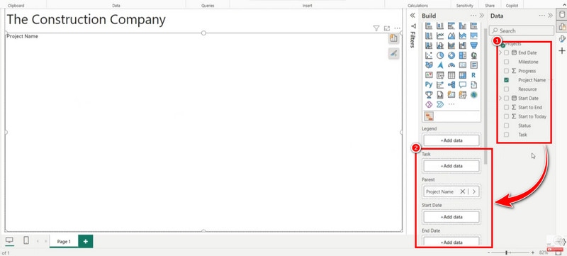
Then, from the software's main interface, go to the Build option and select the Import Visual from a File option. With that, you can add the Gantt chart template from your computer.
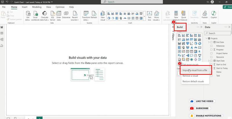
Note: Since the software doesn't support a Gantt chart template, you must download one from the internet.
Now, you can begin creating the Gantt chart. You can drag the Project Name option to the Parent section. You can also drag other parameters, such as Start Date, Progress, Status, Milestone, and more.
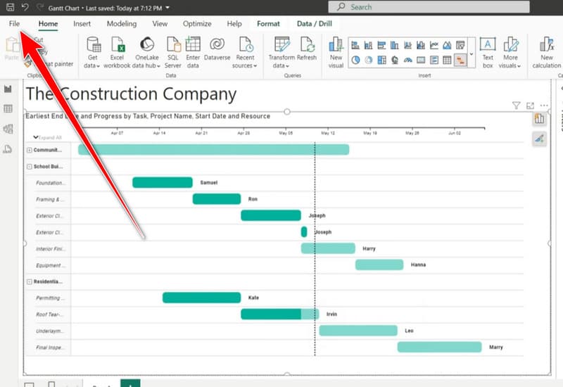
Once done, you will see all the information on your chart.
Once you have finished creating the Gantt chart in Power BI, you can proceed to the final process. Go to the top-left interface and hit the File > Save as option. Then, select your preferred format and tap OK.
With this process, you can create the best Power BI Gantt chart. You can also navigate all the necessary features to achieve the desired result. The only disadvantage here is that the program doesn't support templates, which is bad news for some users.
Part 3. Best Alternative to Power BI
For some users, Power BI may be unsuitable since it can't instantly provide all the features and templates needed to create an excellent Gantt chart. In that case, if you need an alternative to the software, we suggest using MindOnMap. When it comes to crafting a Gantt chart, this software is preferable since it provides all the necessary features without relying on third-party platforms. You can also access various ready-made templates if you prefer. The good thing here is that its user interface is a lot easier compared with Power BI. With that, even if you are a non-professional user, using the tool poses no problem.
Additionally, with the program's auto-saving feature, you don't need to worry about losing information. The tool can automatically save any changes during the creation process. You can also access various elements, such as connecting lines, shapes, tables, font styles and sizes, and themes. With that, if you are looking for an excellent alternative to Power BI for creating a Gantt chart, you can rely on this software.
Follow the steps below and learn how to make an engaging Gantt Chart.
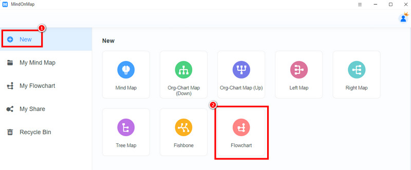
Install MindOnMap on your desktop. After that, you can launch it immediately to view its primary interface.
Secure Download
Secure Download
After that, navigate to the New section and tick the Flowchart feature. With that, another interface will show up on your screen.
You can start making a Gantt chart. From the left interface, you can use the General function to insert all the shapes you need. To insert text inside the shape, just double-right-click it.
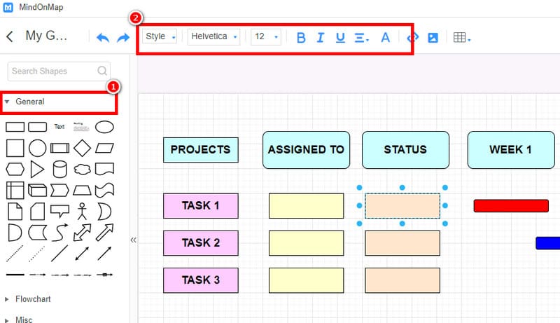
You can also access all the functions above during the creation process.
After the process, you can now begin saving the chart. To save it on your desktop, tap the Export function. Then, you can choose your preferred output format. You can also preserve the chart by tapping the Save button.
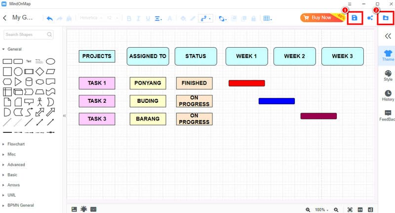
Click here to see the complete Gantt chart.
Using this tutorial, you can tell that creating a Gantt chart is easy. You can even access all the needed features, making it more ideal and reliable. So, if you need an exceptional Gantt chart software, use MindOnMap right away.
Part 4. FAQs about Power BI Gantt Chart
What is the use of a Gantt chart in Power BI?
Well, the main purpose of a Gantt chart is to create a comprehensive visual representation to track progress, manage projects, and see the duration of the task. With this visual tool, you can easily gain insight into the entire project.
What is the advantage of a Gantt chart in event planning?
The chart provides all the necessary information about the event. You can see who is assigned to the task, the duration of the event, and all the plans you have. With this chart, there's a higher chance of having an organized and successful event.
What is the difference between a Timeline and a Gantt chart?
Both are excellent visual tools. They can display tasks in chronological order. However, a Gantt chart is more detailed, as it can show the dependencies, start and end dates of tasks, and provide a comprehensive project overview.
Conclusion
In this article, you have learned how to make a Power BI Gantt chart effectively. You also discovered that you can import data from other platforms into the software to create a detailed visual representation. However, you have also learned its drawbacks, which can dissatisfy users. If you're looking for an exceptional alternative to this tool, we recommend MindOnMap. This tool offers a more user-friendly interface and essential features, making it a superior alternative to Power BI.