What is Pie Charting: Detailed Information about Pie Chart
One sort of graph that illustrates the information in the circular graph is a pie chart. The pie slices display the data's relative sizes. It is a specific kind of graphical data representation. A list of categorical categories and the numerical variables are needed for a pie chart. But wait, there’s more. In this guidepost, we will discuss everything about pie charts. It includes its full definition and when to use the chart, templates, alternatives, and examples. Moreover, the article will give you the best pie chart method. If you are excited to learn about this topic, it would be best to read this guidepost.

- Part 1. Pie Chart Definition
- Part 2. When to Use Pie Chart
- Part 3. Pie Chart Examples
- Part 4. Pie Chart Templates
- Part 5. Pie Chart Alternatives
- Part 6. Method to Create A Pie Chart
- Part 7. FAQs about Pie Chart
Part 1. Pie Chart Definition
A pie chart is helpful in organizing and displaying data by the percentage of the total. This type of visualization uses a circle to represent the entire thing and slices in keeping with its moniker. It symbolizes the various categories that make up the whole. A user can use this chart to compare the relationship between various dimensions. The numerical data is typically divided into percentages of the overall sum on the chart. Each slice represents the value's percentage and should be measured as such.
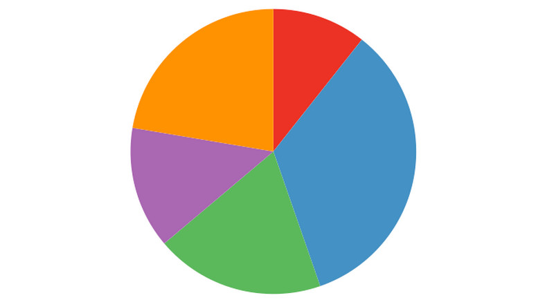
When interpreting a pie chart, you must consider each slice's area, arc length, and angle. Meaningful grouping is crucial because it can be challenging to compare the slices. To make a pie chart easier for the user, it needs to arrange logically, typically from largest to smallest. To effectively process the data, start with the most significant component and work down to the smallest. To reduce the time viewers must spend consulting the legend, the colors of the slices should correspond to the corresponding blocks in the legend.
Furthermore, you should use a pie chart to illustrate how various components relate to the overall. They perform best when applied to dimensions with a few category options. A pie chart can help the data story shine out if you need to show that one part of the entire is overrepresented or underrepresented. Pie charts are ineffective for comparing precise figures.
Part 2. When to Use Pie Chart
In this part, you will learn when to use a pie chart. We will give some use cases to understand when there is a situation where you need to use a pie chart.
There are two main use cases for a pie chart.
1. The exact sizes of the slices are less crucial if you want your audience to understand the relationship between the parts and the whole in your data.
2. To express that a portion of the overall is little or large.
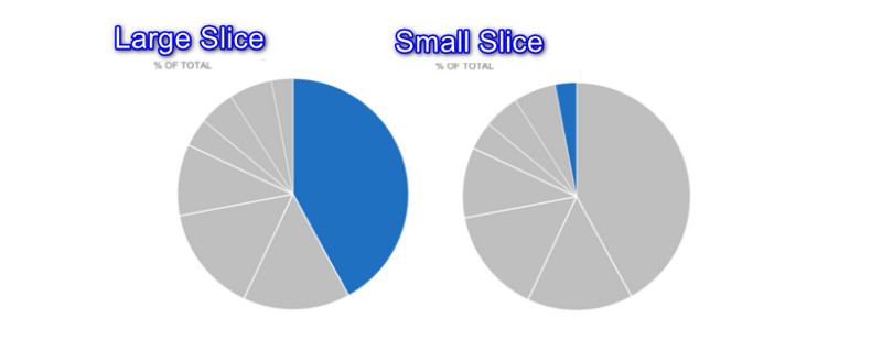
In the second use case, you can easily make one broad conclusion. The pie is either relatively larger or smaller than the others.
Part 3. Pie Chart Examples
2D Pie Chart
A circular graph called a 2D pie chart shows how frequently different variables occur in a dataset. This kind of pie chart shows the pie chart entries in two dimensions.
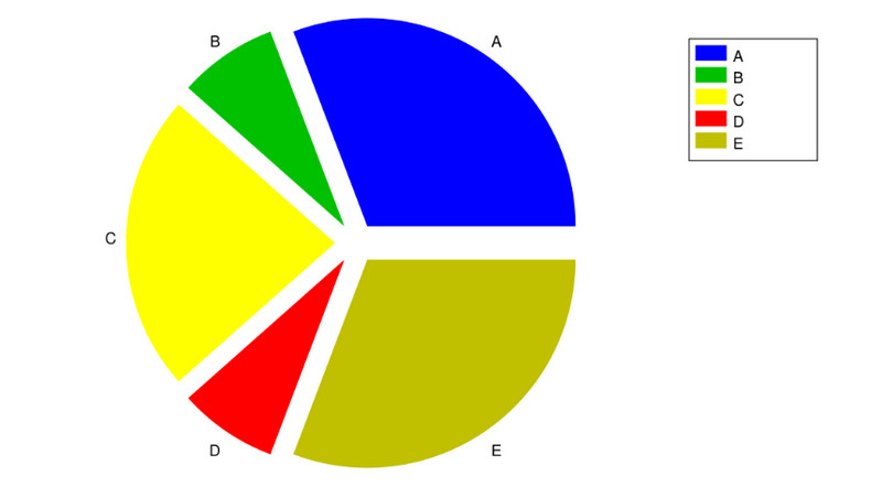
Exploded Pie Chart
An exploded pie chart is produced by splitting the pie from the chart rather than combining them. On a pie chart, this is typically done to draw attention to a particular slice or area.
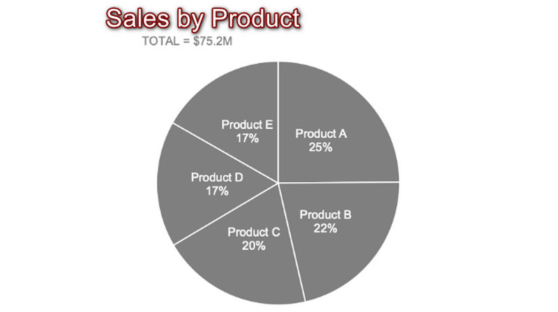
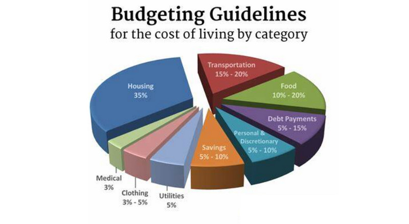
Budget Pie Chart
Another example is the budget for each category. A pie chart helps divide all the possible expenses.
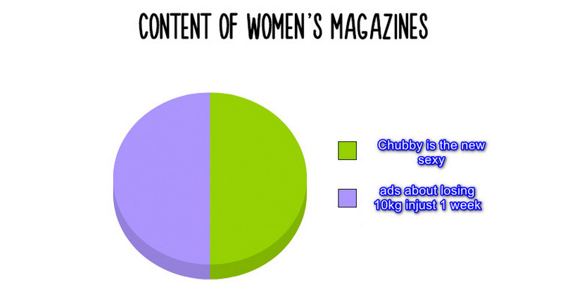
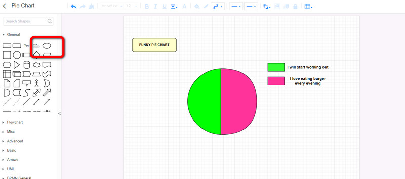
Funny Pie Chart
Nowadays, you can see a funny pie chart on the internet. Its main reason is to make people happy with memes, jokes, and more.
Part 4. Pie Chart Templates
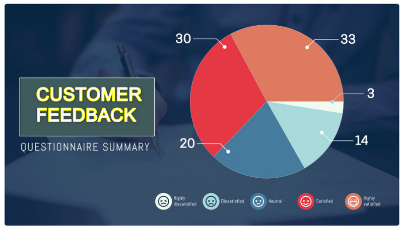
Customer Feedback Pie Chart Template
Use this pie chart template to show what consumers say about your company. With the help of this template, you will get the opinion and responses of the customers. This way, you will get an idea of what actions to take.
Most Visited Destination Pie Chart Template
This pie chart template displays the world's most well-known travel locations. If you plan to travel, you can see this chart as your basis.

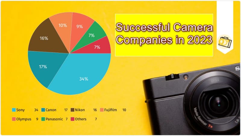
Camera Companies Sales Pie Chart Template
Use this pie chart template to present the sales numbers of well-known camera manufacturers. This will give an idea to the people who want to avail a camera.
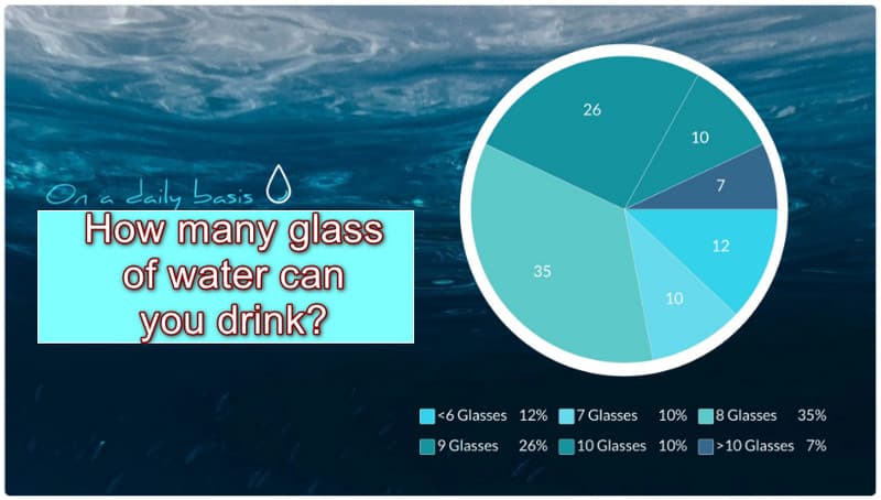
Water Consumption Pie Chart Template
With this pie chart template, you may display how many glasses of water you take daily. Also, you will see the percentage to see the differences.
Part 5. Pie Chart Alternatives
Sometimes, some data is not meant for pie charting. If you have a lot of data, it will be complicated to use a pie chart. In that case, you will need the best alternative for a pie chart. In this part, you will learn all the visual illustrations you can use besides pie charts.
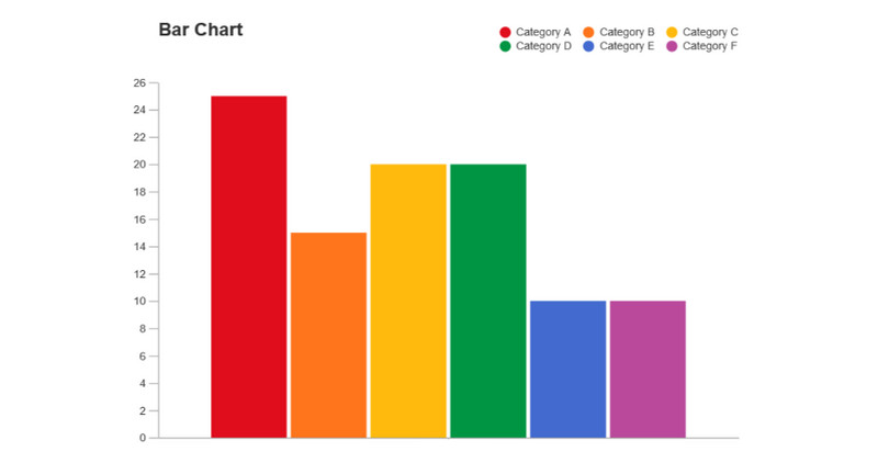
Bar Chart
The bar chart poses the biggest threat to the pie chart. A bar chart is preferable to a pie chart because it will convey your arguments more succinctly and simply. A Bar chart is suitable to address many of the problems with pie charts. Bar charts, on the other hand, do not effectively convey the part-to-whole comparison, which is a pie chart's main advantage.
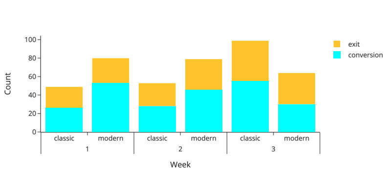
Stacked Bar Chart
On the other hand, the stacked bar chart type is a powerful competitor to the pie chart in terms of its ability to convey a part-to-whole comparison. You can compare the single stacked bar chart to a rectangular version of a pie chart's slices. Also, the rectangular shape makes comparing category breakdowns between various groupings simpler. Pie charts are still worth considering for the part-to-whole comparison use case because of their advantages in familiarity and aesthetics.
Waffle Chart
On the other hand, the stacked bar chart type is a powerful competitor to the pie chart in terms of its ability to convey a part-to-whole comparison. You can compare the single stacked bar chart to a rectangular version of a pie chart's slices. Also, the rectangular shape makes comparing category breakdowns between various groupings simpler. Pie charts are still worth considering for the part-to-whole comparison use case because of their advantages in familiarity and aesthetics.
Part 6. Method to Create A Pie Chart
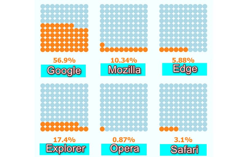
Do you plan to create a pie chart? In that case, the best tool we can offer you is MindOnMap. MindOnMap has an easy-to-understand interface with basic procedures for creating a chart. This way, all users, especially beginners, can utilize the tool. Moreover, the online tool offers various shapes, font styles, themes, and more, making it convenient. After creating a pie chart, you can save it in various formats. You can save your chart to PDF, SVG, PNG, JPG, and more formats. Furthermore, MindOnMap is available to all browsers. It includes Google, Safari, Explorer, Edge, Mozilla, and more. You can even use the tool on your mobile devices.
Go to your browser and visit the MindOnMap website. The first step is to create your MindOnMap account. Then, click the Create Online option. MindOnMap also released its desktop version, and you can click Free Download below to get it.
Secure Download
Secure Download

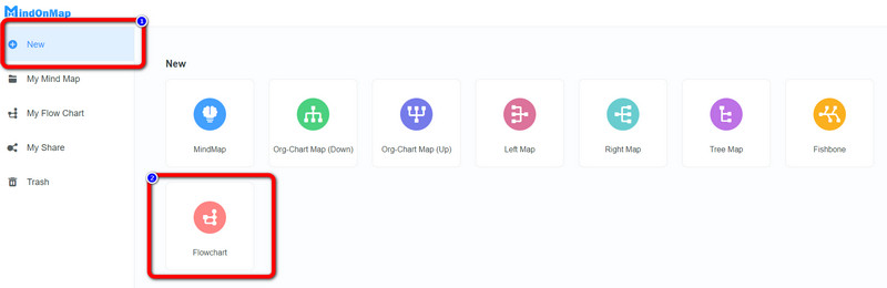
After that, click the New option on the left screen. Then select the Flowchart icon. After doing that, you will see that the main interface will appear on the screen.
When the interface shows up, you can start creating your pie chart. You can use the circle shape on the left interface. Also, to put color, go to the Color fill option. Create your pie chart based on your preference.
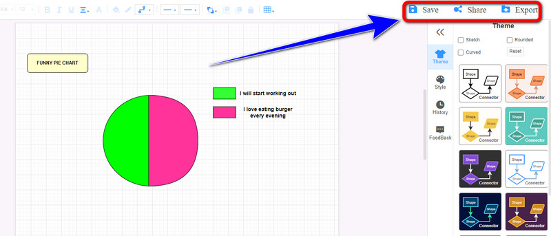
After creating a pie chart, click the Save button to save the chart on your account. Click Share to share the chart with others. Lastly, click Export to save the chart to various formats.
Further Reading
Part 7. FAQs about Pie Chart
1. Why do we use pie charts?
We use pie charts to represent data in a single chart. Its concept is to know the percentage of the data from the whole pie.
2. What are the two types of pie charts?
The two pie chart types are 2D and 3D pie charts based on graph dimension.
3. How to calculate the percentage of the data on the pie chart?
You need to measure the angle of each slice. After that, divide it by 360 degrees. Then, multiply by 100. This way, you can calculate the percentage of the data.
Conclusion
The information above is all we can offer about the pie chart. Now, you have given an idea about the pie chart, its examples, templates, and alternatives. In addition to that, you learned the way to create a pie chart using MindOnMap. This online tool helps you to create a pie chart without encountering a problem.