Bar Chart vs. Histogram: Complete Description Including a Bar Graph Maker
Do you feel like you need clarification about histograms and bar graphs? Do you think they are the same? Well, that is the topic that we will discuss in this article. We will provide complete details about these two visual representation tools. If you want to discover the differences between a bar chart and histograms, read this post. This way, you can get the answer you seek. In addition, after discovering their differences, there is one thing you need to know. If you need a bar graph maker to make a bar graph, that is not a problem. While reading, you will also know the simple procedure of creating a bar graph with the help of a bar graph maker.

- Part 1. What is Histogram
- Part 2. What is Bar Graph
- Part 3. Differences Between Histogram and Bar Graph
- Part 4. Ultimate Bar Graph Maker
- Part 5. FAQs about Histogram vs. Bar Graph
Part 1. What is Histogram
A histogram is a graphical depiction of the data distribution in statistics. The histogram is a collection of rectangles placed side by side, each with a bar that represents some data. Several fields use statistics, which is a branch of mathematics. The frequency of numerical repetition in statistical data is referred to as frequency. A frequency distribution, a table, can be used to represent it. One of the graphs that may be used to display a frequency distribution is a histogram.
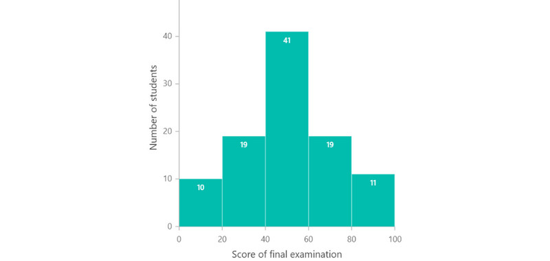
The graphic representation of a grouped frequency distribution is called a histogram. It also has continuous classes. It can be described as a collection of rectangles and is an area diagram. Bases and gaps between class borders are both present. Also, it has regions proportionate to the frequencies in the relevant classes. All the rectangles are contiguous in such representations. This is due to the base's coverage of the spaces between class boundaries. Rectangle heights are correlated with comparable frequencies of related classes. The heights will correlate to the respective frequency densities for various classes. So, a histogram is a figure with rectangles whose area is proportional to a variable's frequency. Also, the width and class interval are equal.
Part 2. What is Bar Graph
The bar graph or bar chart visually represents a group of data/information. You can see the bar graph as a vertical or horizontal rectangular bar. In addition, you can see that the length of the bars is symmetrical to the data’s measure. Aside from that, a bar graph is also a bar chart; they are the same. A bar graph is a type of visual presentation tool. It is among the data management processes in statistics. Additionally, you can observe the variable quantity of one of the axes. Then, the drawn bars are all the same width.
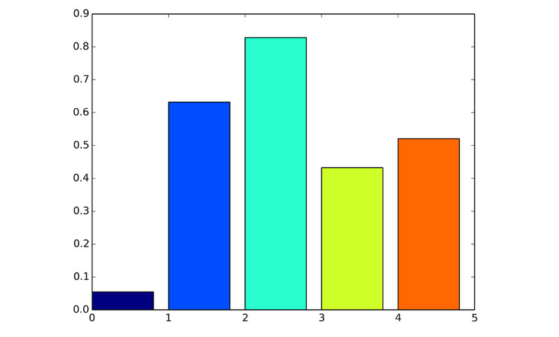
The variable's measure can be seen on the other axes as well. The bars display the distinct values themselves. Also, it shows how a variable has distinct values. The scale describes the number of values on a bar graph's x-axis or column graph's y-axis. Different numbers are also compared using these graphs. It is so because the bars' heights or lengths correspond to the variable's value. Bar graphs display frequency distribution tables and make it easier to understand the data. It can plainly and efficiently simplify calculations.
Part 3. Differences Between Histogram and Bar Graph
Key Features of Histogram
◆ Arrange the data in increasing sequence.
◆ It represents quantitative data by grouping it into bins.
◆ Determine the frequency or distribution of in-data values.
◆ There are no spaces between the bars. It means that there is no gap between the bins.
◆ The width of the histogram may vary.
◆ The distribution of variables is non-discrete.
◆ You cannot rearrange the block in the histogram.
Key Features of Bar Graph
◆ It has no strict organizational rules.
◆ It plots datasets with data values. They are divided into various categories.
◆ It can determine the relationship between categories.
◆ The bar has spaces with each other.
◆ The width of a bar chart is equal.
◆ Comparison of discrete variables.
◆ Rearranging the block is standard in a bar graph. You can arrange it from highest to lowest.
Pros and Cons of A Histogram
PROS
- Display enormous amounts of data.
- You can see the various data values on the frequency of occurrences.
- Helpful for calculating the process capability.
- It shows the frequency of occurrences of data with intervals.
CONS
- It only uses continuous data.
- Comparing two data sets is challenging.
- Hard to read exact values since the data is grouped into categories.
Pros and Cons of A Bar Graph
PROS
- To compare various categories of the data.
- Suitable for categorical and numerical data.
- Summarize extensive data in visual form.
- It clarifies trends better than using a simple table.
- It shows relative proportions of multiple categories.
CONS
- It only displays categories of the data set's elements.
- The bar graph needs additional explanation.
- Not capable of revealing causes, patterns, assumptions, etc.
Part 4. Ultimate Bar Graph Maker
To create a bar graph, use MindOnMap. This bar graph maker lets you use elements you need on your graph, like bars, lines, text, numbers, and more. Also, you can add colors to your bars to make them more attractive and pleasing to view. Additionally, the online tool offers an intuitive user interface and simple methods. This way, the tool will be perfect for all users. Aside from that, you are also allowed to use free themes. The themes can add additional color to the background of your bar graph. There are more features you can encounter when using the tool. It has an auto-saving feature allowing you to save your work automatically during graphing. Also, it has a collaborative feature. This feature lets you brainstorm with other users and share your bar graph. Furthermore, you can export the bar graph to various output formats. You can export the graph to PDF, JPG, SVG, PNG, DOC, and more. MindOnMap is also accessible to all web platforms. The tool is available on Firefox, Google, Edge, Safari, and other browsers. Follow the simple instructions below to see how to create a bar graph.
Secure Download
Secure Download
Go to the MindOnMap website. Create your MindOnMap account or connect your Gmail account. Then, click the Create Your Mind Map option.
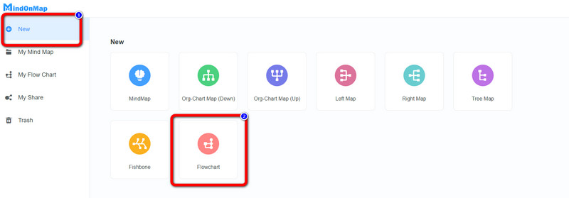
After that, select the New menu on the left web page. Then, click the Flowchart icon to start creating a bar chart.
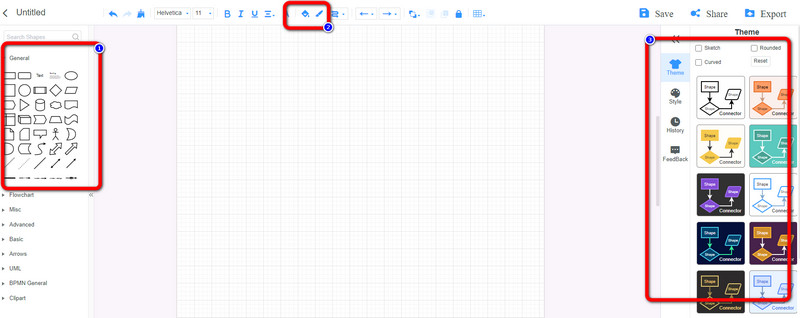
When the interface of the bar graph maker shows up, you can start making a bar graph. Go to the left interface to use lines, text, and bars. See the Fill Color option on the upper interface to add colors to the bars. The themes are on the right interface.
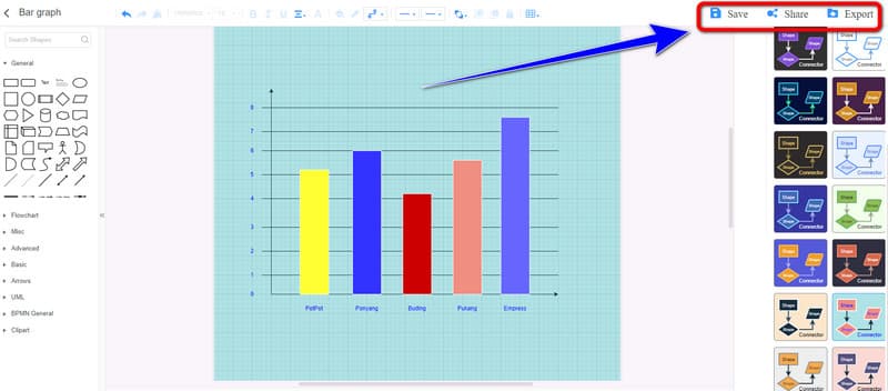
Click the Save button to save the final bar chart on your MindOnMap account. If you want to share your work with others, click the Share option. Lastly, click the Export button to export the graph to PDF, JPG, PNG, SVG, DOC, and more formats.
Part 5. FAQs about Histogram vs. Bar Graph
1. When to use a histogram or bar graph?
Use histogram when you are dealing with continuous data. When the data is discrete, use a bar graph. Continuous data is data that you can measure. For example, if you like to compare the river's temperature every month, use a histogram. If you want to deal with the number of boaters every month, use a bar graph.
2. How do bar graphs display data?
A bar graph is a chart that visually compares two categories of data. It displays grouped data using parallel rectangular bars. The bars have equal widths and different lengths. The length of the bars reflects the values of each rectangular block. It represents a distinct category, holds.
3. Is a histogram a bar graph?
Histogram and bar graphs look similar but are not the same. Use a histogram to deal with height, width, and temperature. It represents continuous data that you can measure. On the other hand, you can use a bar graph on discrete data. For example, use a bar graph to count the car in a parking area with various colors.
Conclusion
After reading the article, you know how a histogram differs from a bar graph. Also, you discovered the method to create a bar graph using an online tool. So, if you want to create a bar graph, use MindOnMap. This tool offers all the necessary elements to create a simple and excellent bar graph.