Effective Methods on How to Create A Bar Graph in Excel and Using Online Tool
A bar graph is one of the popularly used graphs in Excel. It is because creating a bar graph is simple and easy to understand. This bar can help you make comparisons of numeric values. It can be percentages, temperatures, frequencies, categorical data, and more. In that case, we will give you the most straightforward method to make a bar chart in Excel. Moreover, besides using Excel, the article will introduce another tool. With this, you will get an option on what to use when creating a bar graph. If you want to know the method of creating a graph along with the best alternative, read this article.

- Part 1. How to Make A Bar Graph in Excel
- Part 2. Alternative Way of Creating A Bar Graph in Excel
- Part 3. FAQs about How to Make A Bar Graph in Excel
Part 1. How to Make A Bar Graph in Excel
If you want to visualize your data using a bar graph, you can rely on Excel. Many people are not aware of the full capabilities of this offline program. In that case, you need to read this post. One of the excellent features you can find in Excel is the capability to create various chart types, including bar charts. You can operate this offline program to compare data using a bar graph. Microsoft Excel can provide various shapes, lines, text, and more for creating a bar graph. It has an easy-to-understand interface, making it suitable for non-professional users. Moreover, if you don’t want to use the shapes for creating a bar graph, Excel can offer another way. One of the best things you can experience in this program is it can offer free bar graph templates. All you need is to insert the data in Excel, then insert the bar graph templates. Aside from that, you can customize the color of the bars, change labels, and more.
However, Microsoft Excel has some disadvantages. First, you need to insert all your data in the cells, or else the free template won’t appear. Also, Excel can’t offer you all its features when using the free version. So, if you want the full feature of this program, buy a subscription plan. In addition, the program's installation process is confusing, especially for new users. You need the assistance of professionals when installing Excel on your computer. To make a bar chart in Excel, follow the guide below.
Download and install Microsoft Excel on your Windows or Mac operating system. After the installation process, launch the offline program on your computer. Then, open a blank document.
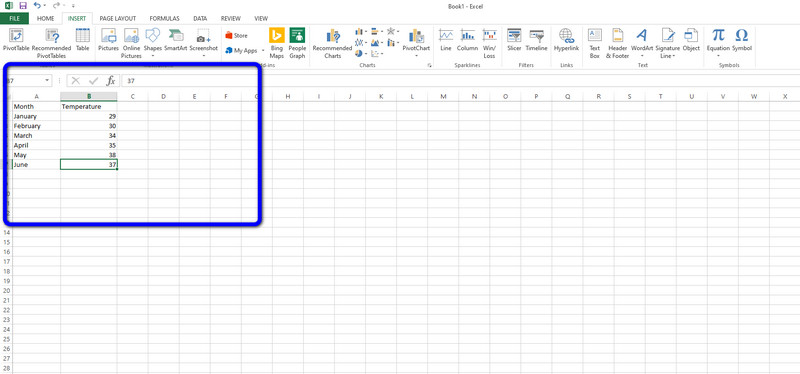
Then, put all the data on the cells. You can insert letters and numbers to complete the data you need for your bar graph.
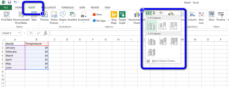
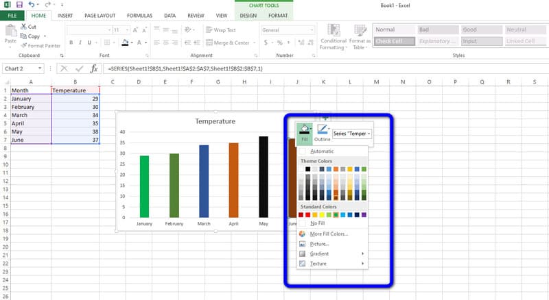
Afterward, when you insert all the data, click the Insert option on the upper interface. Then, click the Insert Column Chart option. You will see various templates you can use. Choose your desired template and click it.
After that, the bar graph will appear on the screen. You can also see that the data is already on the template. If you want to change the bar color, double-right-click the bar and click the Fill Color option. Then, select your chosen color.
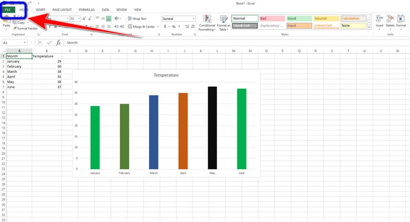
When you are done, you can already save your final bar graph. Navigate to the File menu on the top-left corner of the interface. Then, select the Save as option and save your graph on your computer.
Part 2. Alternative Way of Creating A Bar Graph in Excel
Since Microsoft Excel can’t offer its full features on the free version, users can operate the offline program with limitations. In that case, we will give you an exceptional alternative to Excel. If you want to enjoy the full feature of a bar graph maker without purchasing a plan, use MindOnMap. This online tool lets you enjoy its full capabilities without paying a penny. You can encounter many features, and we will discuss them as we move forward. You need rectangular bars, lines, numbers, data, and other elements to create a bar graph. Thankfully, MindOnMap can provide all the said elements. You can create a bar graph in just a few steps. The good thing about this online tool is that the interface won’t give trouble to all users. Each option from the interface is understandable, making it a perfect layout for users.
Additionally, the themes are available on this software. It means that you can give flavor to your bar graph background. This way, you can get a colorful and attractive chart while comparing certain concepts. One of the features you can find when using this tool is the easy sharing feature. If you want to brainstorm with your teammates or with other users, it is possible. The easy sharing features let you send your chart with others for idea collision. This way, you don’t need to talk to other users in person. All you need is to send your work and acquire new thoughts from them. MindOnMap is simple to access. No matter what device you use, as long as it has a browser, you can access MindOnMap. Lastly, you can export your bar graph in various formats for further preservation. You can ensure that your output won’t get deleted or disappear quickly. You can follow the most straightforward tutorials below to create a bar graph.
Secure Download
Secure Download
For the first step, visit the official website of MindOnMap. Then create your MindOnMap account. To access MindOnMap easily, you can connect your Gmail account. After that, on the center part of the web page, click the Create Your Mind Map option. Expect that another web page will appear on the screen.

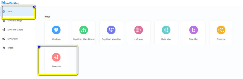
Select the New menu on the left part of the web page. Then, click the Flowchart option to start with the bar graphing procedure.
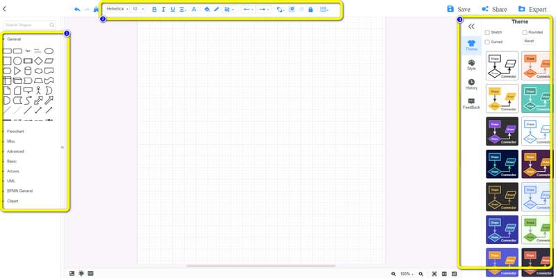
In this section, you can create your bar graph. You can go to the left interface to use rectangular shapes and add text, lines, and more. Also, go to the upper interface to change the font styles, add color, and resize the text. You can also use the free themes on the right interface for five more bar graph impacts.
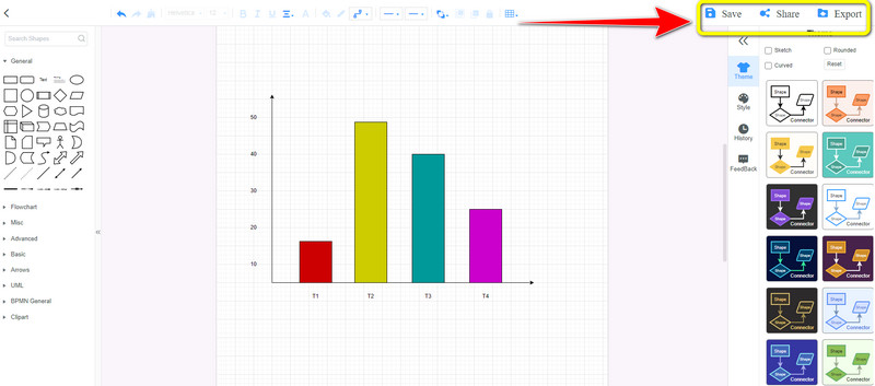
If you are finished, save your final output. Click the Save option to save the bar graph on your MindOnMap account. If you want to download the bar graph on your computer, click Export. Also, to share your work with other users, click the Share option. You can also let others edit your bar graph after sharing.
Part 3. FAQs about How to Make A Bar Graph in Excel
1. How to make a stacked bar chart in Excel?
Making a stacked bar chart in Excel is simple. After launching the Excel, input all the data for your chart. Then, navigate to the Insert tab and click the Insert Column Chart icon. Various templates will appear, and select the stacked bar chart template.
2. Why are bar charts plotted in a common baseline?
One of the reasons is to allow readers to easily understand the comparison of data. With this type of chart, people can easily interpret data.
3. What happens if the length of a bar graph is more?
It means that the bar has the highest value on the given data. The taller the bar is, the higher the value it has.
Conclusion
If you desire to learn how to make a bar graph in Excel, this post is perfect for you. You will learn all the details of bar graphing. However, its free version has a limitation. That’s why the article introduced the best alternative for Excel. So, if you want a bar graph creator without limitations and for free, use MindOnMap. This online tool can offer you all the things you need to create a bar graph.